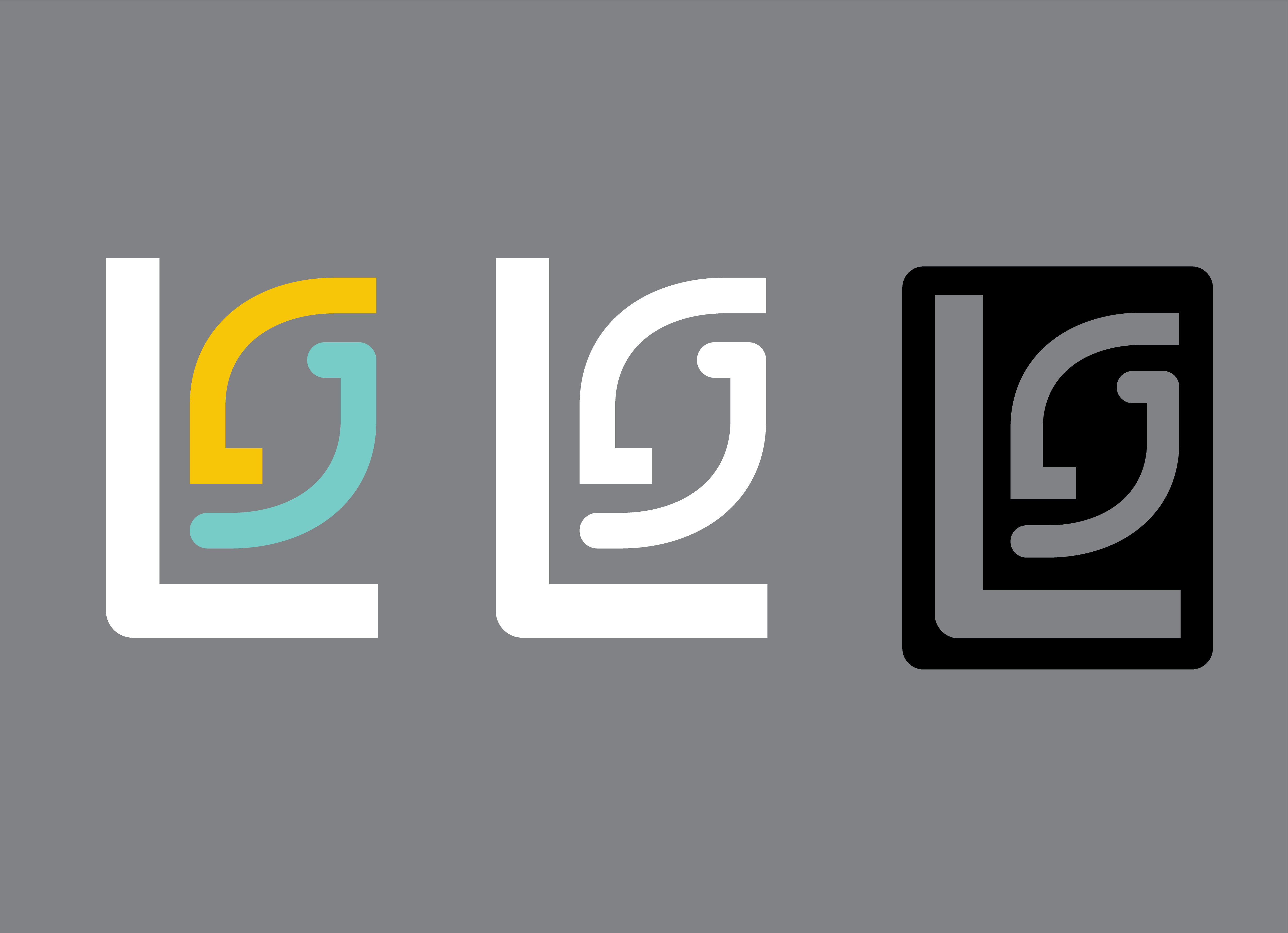

For my logo I based the design on my initials, L and S. I kept the L white to give it more contrast than the two halves of the S, this helps the design be read as LS and not SL. Secondly, I broke the S into two halves. One side has sharp corners and the other round. This represents the serious and playful sides of my design work.
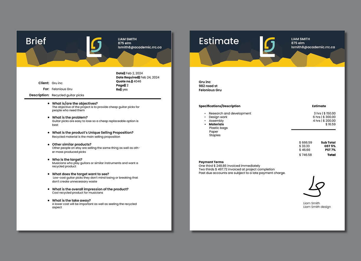
I tried to keep the information separate from the heavy design elements because I didn’t want that to get in the way of the information.

