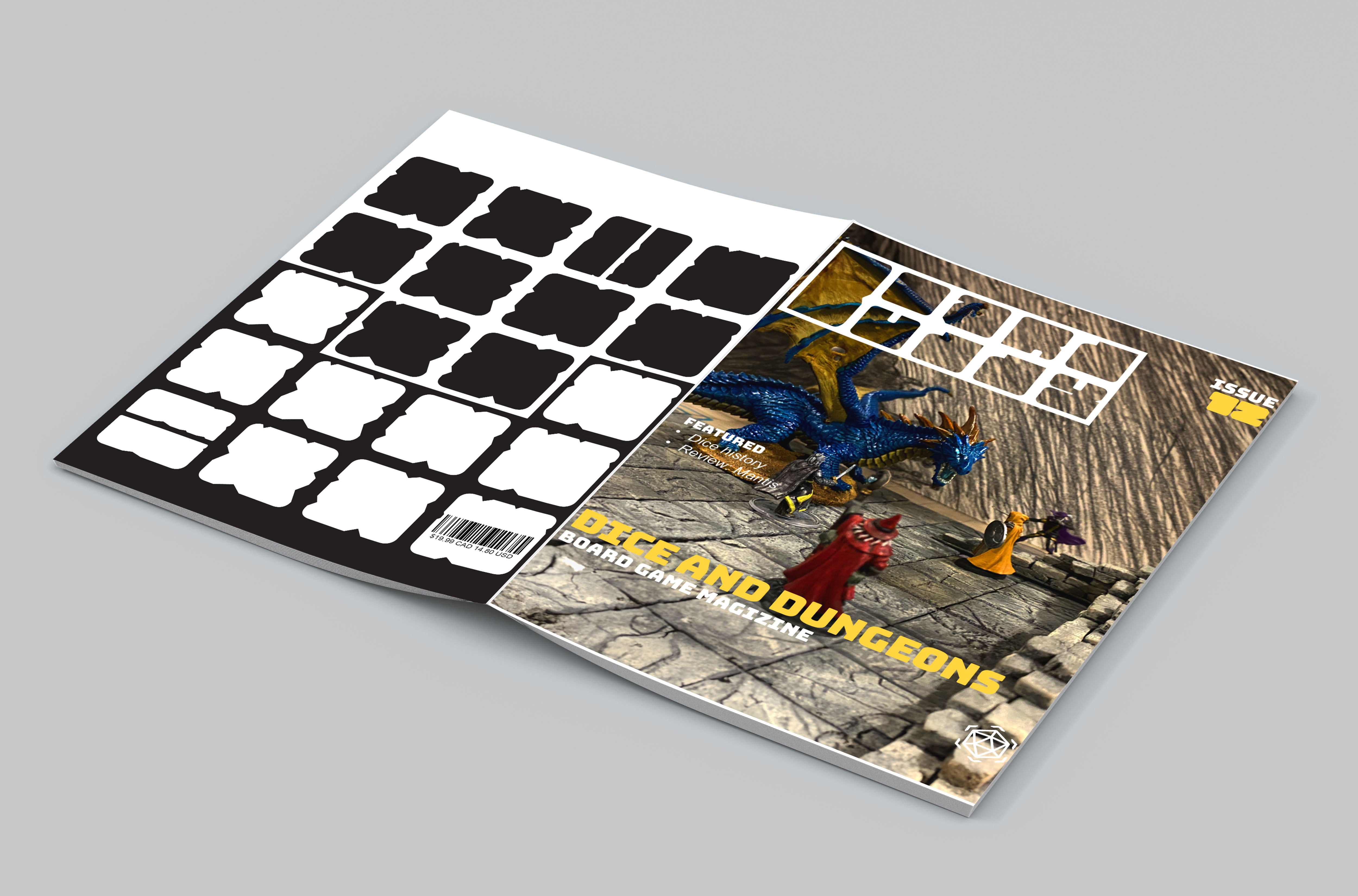

For the cover, I created a scene reminiscent of a tabletop role-playing game, with a focus on the figures and minimal background distractions. The colour scheme predominantly used black and white, with a pop of yellow; this colour would change with each issue of the magazine.
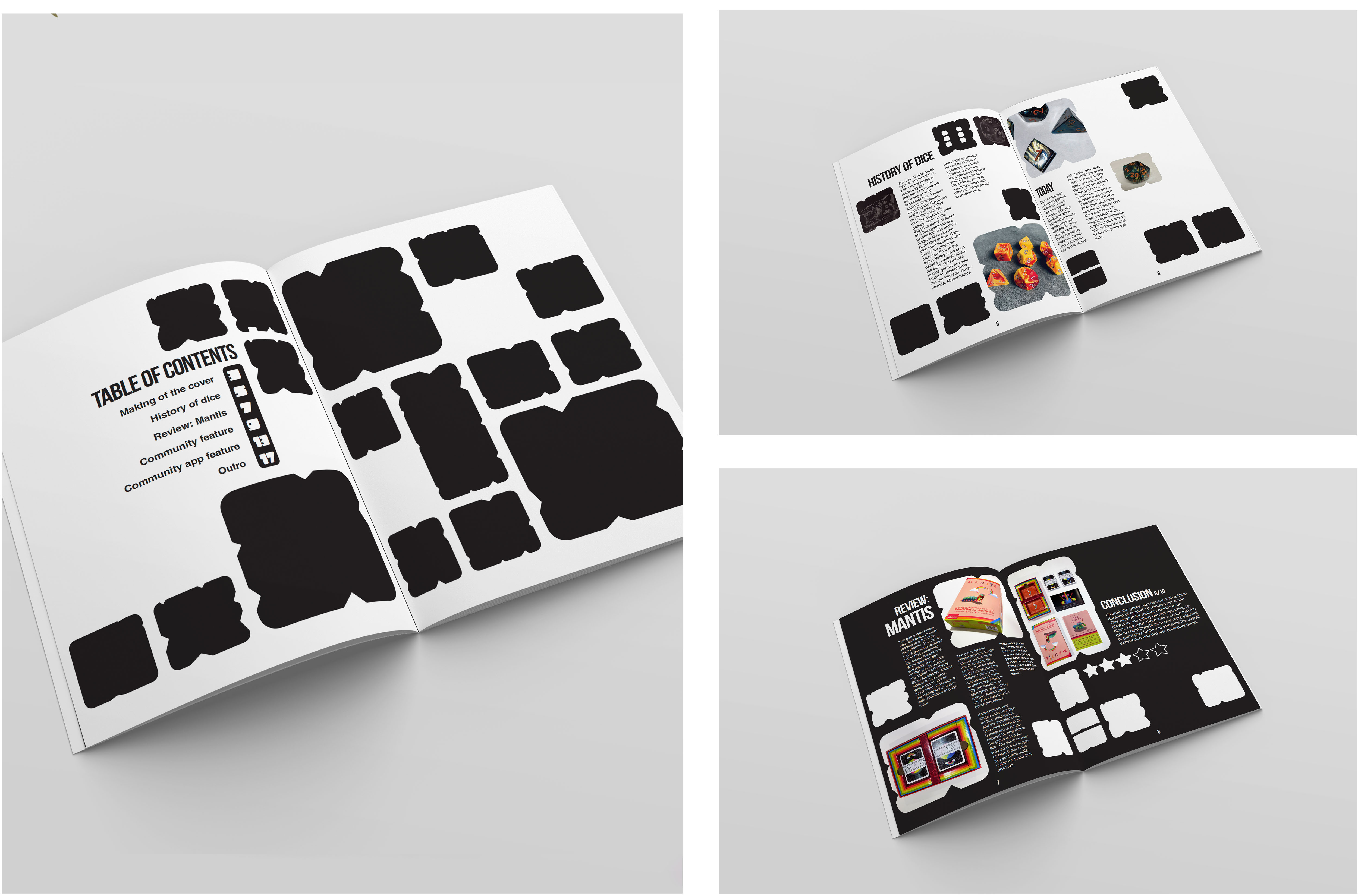
Throughout the spreads, I incorporated graphical elements of weathered white and black squares, resembling stone dungeon tiles or spaces on a board game board. These squares were arranged in a four-column grid, serving as a foundation for spacing tiles and integrating them with typography and images.

