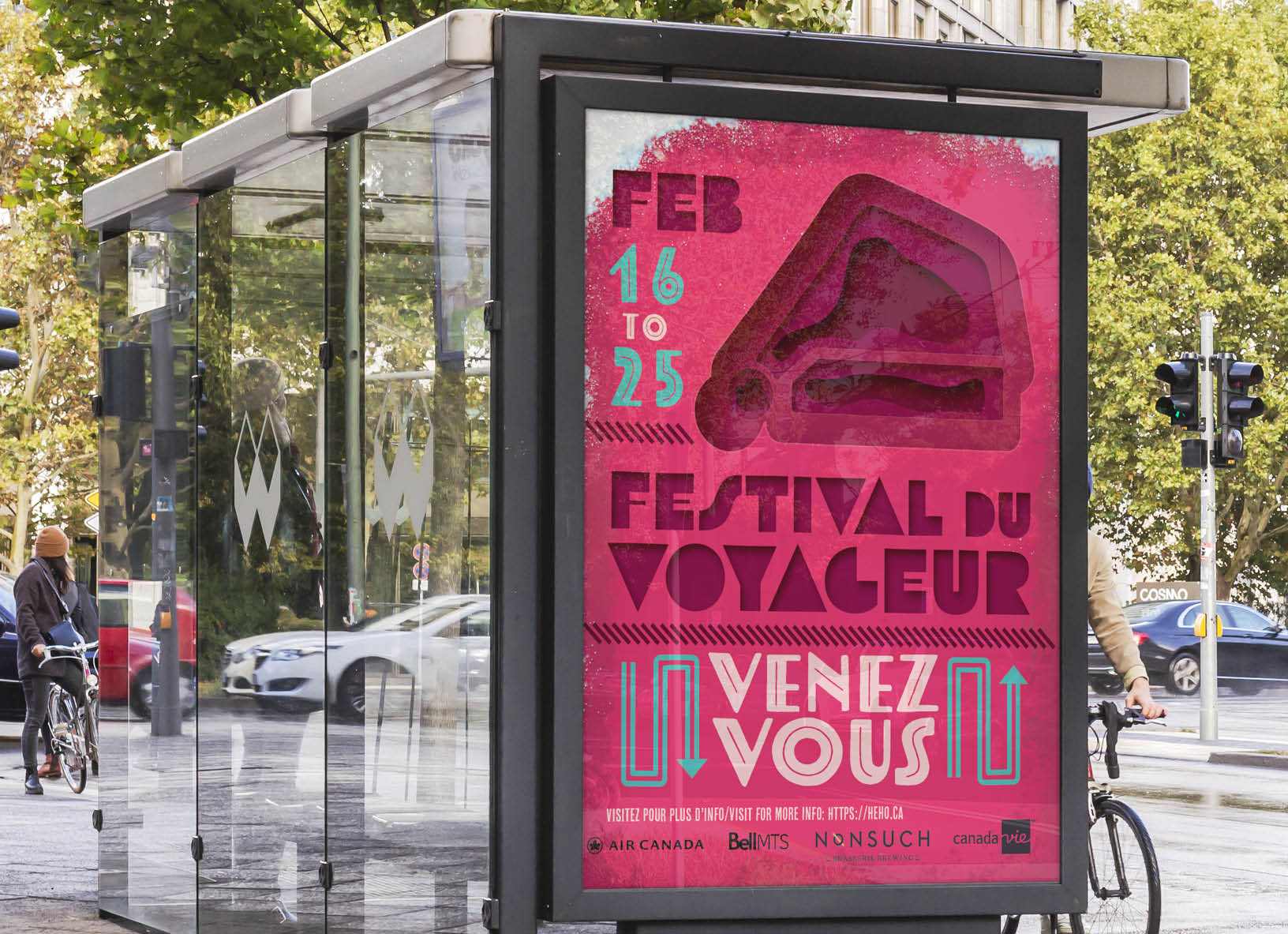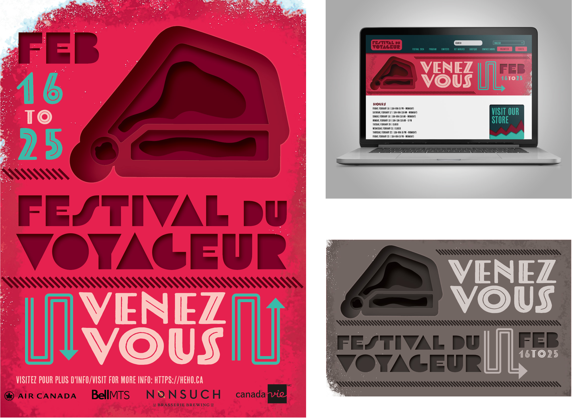

I used contrasting colours for the promotional elements. Red is commonly associated with Festival du Voyager, which is why I chose it. Secondly the teal it’s a contrasting colour which makes the posters pop and differentiates it from others they have previously used.
The website has a very similar layout to what they were using at the time. I mainly changed the colours to match mine and used the layered effect I used in the Hat illustration and the horizontal dashed lines.

